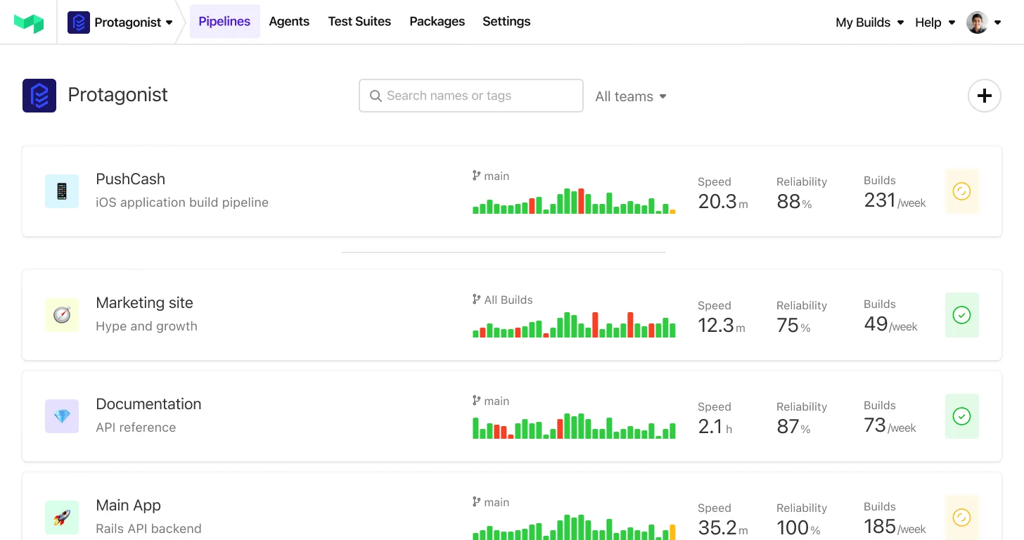
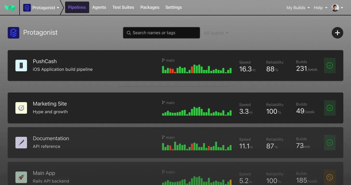
A simpler build page layout with a new list view
Finding the job you care about on a busy build just got faster. The build page has a cleaner layout, a proper list view in place of the old sidebar, and less duplicated information getting between you and what you're actually trying to inspect.
- Find the job faster: Jobs are scannable at a glance, with room to breathe. Long step names are finally readable instead of truncated into uselessness.
- A cleaner layout: Pipeline and jobs on the left, the detail you're inspecting on the right. Less hunting, more space for the thing you care about.
- Works on your phone: The list view is fully responsive, so checking in on a cheeky build while you're AFK is no longer a pinch-and-zoom ordeal.
- Filter jobs by state: Something the old sidebar couldn't do at all. Find that one scheduled step inside a running group without scrolling.
- Groups stay grouped: When you filter or group by state, parallel, matrix and group steps keep their parent visible instead of flattening, so you never lose the context of where a job belongs.
- Less duplication: Repeated headers and metadata are gone, so the information you need stands out.
- Jump to anything, from anywhere: Search straight to a job or step from any view — including the canvas.
Available now for everyone on the new build page — turn it on from your user settings if you haven't already. Tell us what you think at support@buildkite.com.
Chris
Start turning complexity into an advantage
Create an account to get started for free.