Shortly after joining Buildkite a few months ago, I had a conversation with a customer about some UI troubles they were experiencing. Instead of big feature requests or complicated technical issues, the request was pretty simple — they were having trouble telling the difference between passed and failed steps/jobs on the build summary. As a designer, this felt like something I could help with!
In the following weeks I spoke to quite a few customers from across the globe whose engineering teams land on build summaries tens-of-thousands of times a day. The feedback was largely the same — few come to Buildkite to check on green builds, most come to understand what went wrong with failures, and fix them.
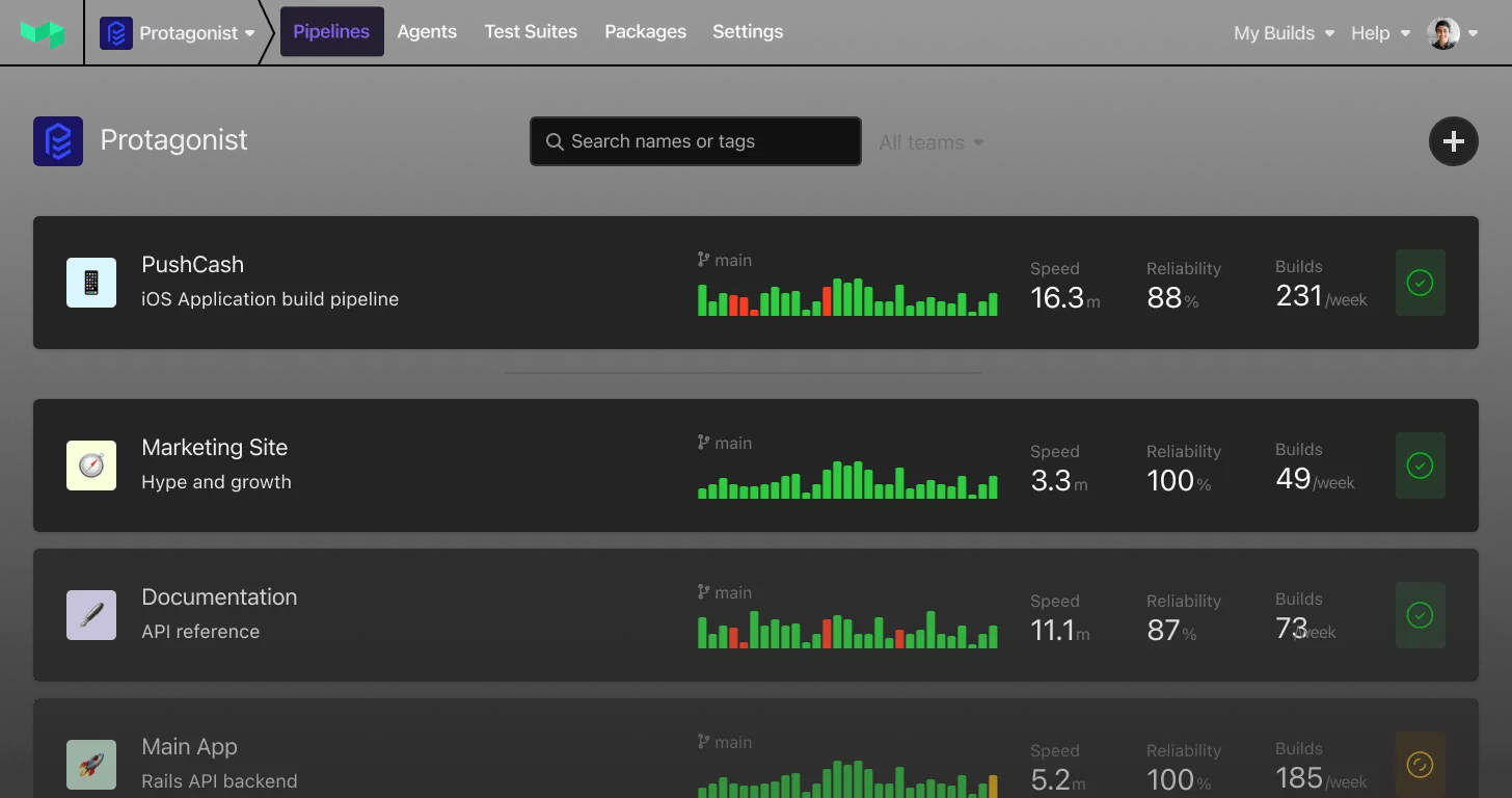
In response, today we launched a redesigned build header — which is the first of a few upcoming changes we’re planning.
Behind the reds and greens
The first step in helping make the build summary more useful was a color change and some subtle visual updates to better differentiate good steps, jobs and builds from failures. As part of this project, I also wanted to make sure that anything we produced was compliant to modern accessibility standards — which meant getting rid of red text on red backgrounds, and tweaking our color pallet towards much bolder and brighter hues. Often color updates can become incredibly technically complex jobs in their own right, but our front-end team nailed this one, even building some cool tooling along the way.
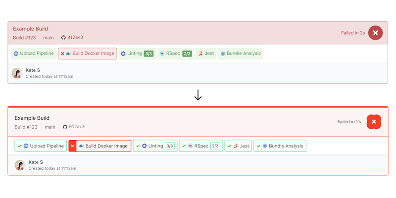
A before-and-after comparison of the colors and styles
By comparison you can see that the red steps jump out, and text is much easier to read and scan — which just by itself is a huge win for engineers trying to quickly locate failures.
Communicating meaning without color
Another priority was to consider people with color blindness — something that affects more people than you'd think… including a number of customers I spoke to during research, and some of our own team. One of the most interesting challenges was designing for the colorblind conditions Protanopia and Deuteranopia — which limit the ability to see red or green, respectively. For a UI that relies so heavily on color to convey meaning — this was no small challenge!
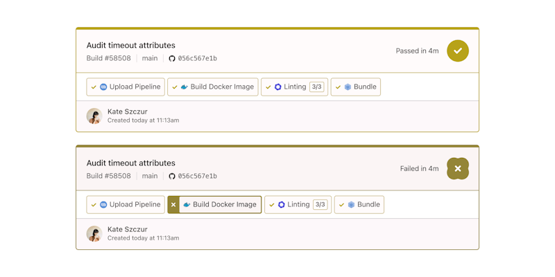
Builds as experienced by someone with Protanopia (reduced perception of reds)
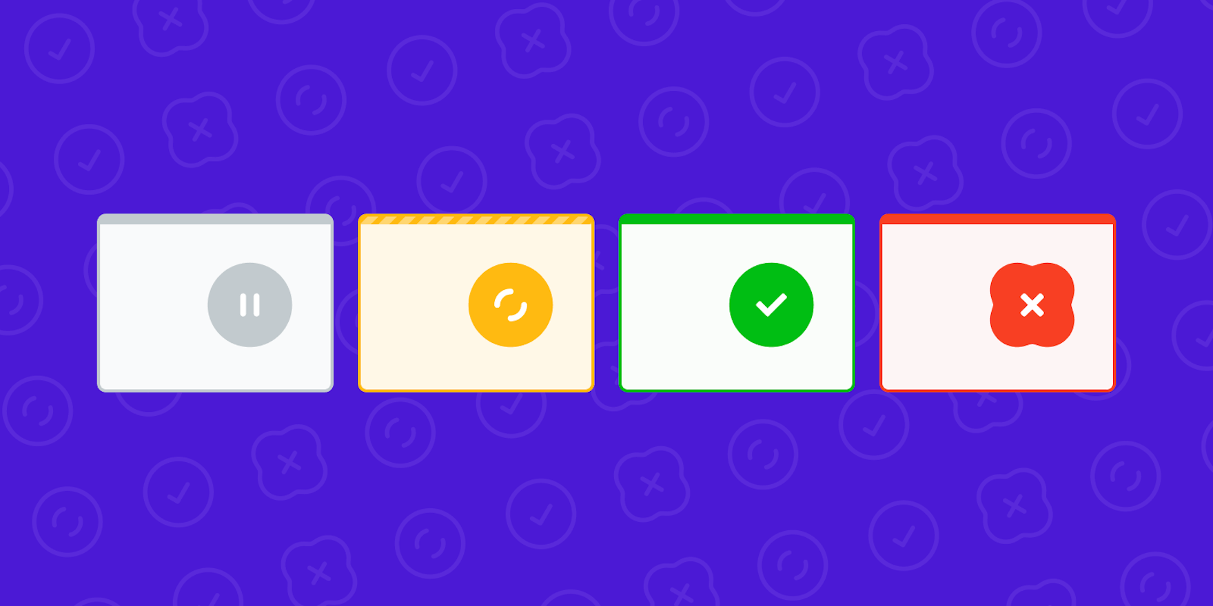
We addressed this in a few ways: Firstly we now display iconography alongside each step to convey its meaning without relying on color alone — passed steps get a check, failed get a cross, and the rest benefit from a whole host of other tiny icons. Secondly, failed builds get a new shape instead of a circle, which I call "the blob" — this means at a glance you can tell if a build is passed or failed by shape, even if you can't detect red. In my experience, accessibility affordances like these end up benefiting everyone.
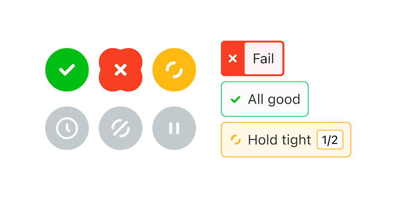
Some of the new iconography we created for builds and steps
Testing the tests
If you know CI/CD you’ll appreciate how complicated some builds can get — which made visual design a little more challenging than other projects I’ve worked on before. To test our work, the Buildkite team have been using the newly designed header behind a feature flag for a few weeks whilst the frontenders and I react to feedback and adjust the designs accordingly. Seeing the new designs applied to real builds in production has been an incredible way to source accurate feedback from engineers and build confidence.
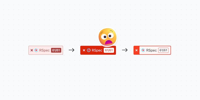
We went through some questionable iterations before finding a style that worked
One interesting change that came from testing was the evolution of the failed step badge… we’d overlooked how terrible emojis looked on red, which is why we ended up using a border instead.
What's next?
The visual updates we launched today will be helpful in quickly identifying failures, but there's still a lot of scrolling required to find issues when a build has more than a handful of jobs. To tackle this, our next release sees the addition of tabs to isolate the specific issues and items that need your attention — instead of showing everything all at once.
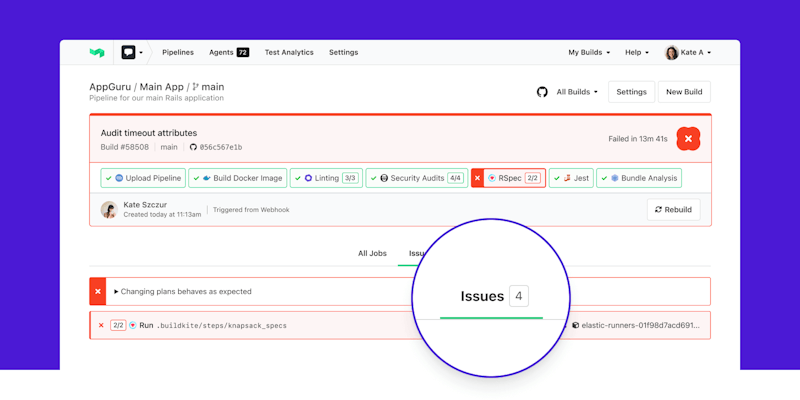
By separating issues from everything, even complex builds are easy to navigate
We figure that less time spent scrolling, and more time debugging will save teams countless hours and frustration — which in my mind is the ultimate measure of success. Unblocking engineers is the core theme of the work that will follow in the coming months — we’re prioritizing ways to help build context around your tests and provide insight into ways to make builds more efficient. So a few new colors are just the tip of the iceberg.
I’d love to hear any feedback you might have about today’s release and any upcoming changes mentioned here — just drop me a line, buzz@buildkite.com