As we expand our product footprint, including adding to Pipelines and Test Analytics, and looking to the future, it's become important to make some visual changes to unify the Buildkite experience. You'll see some of those changes now.
What's new
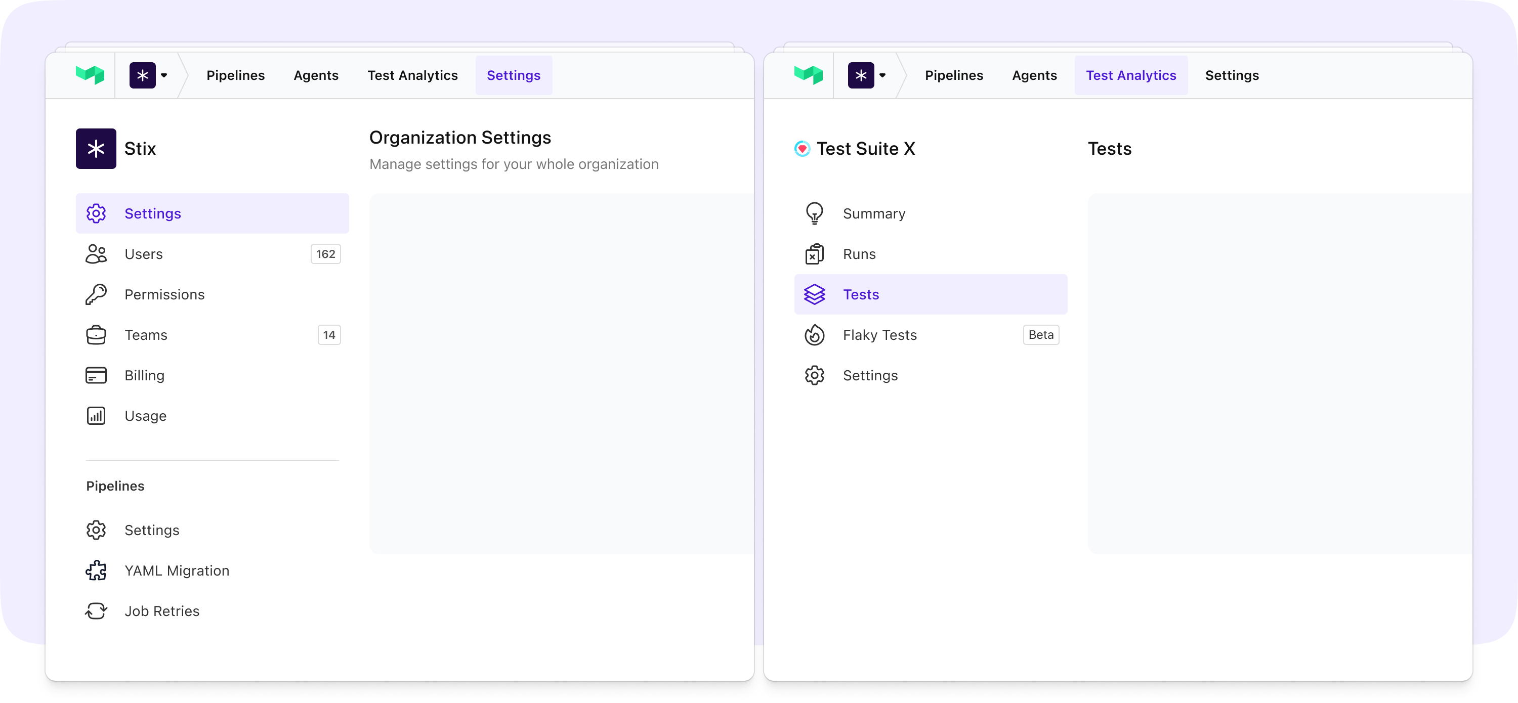
The theme of the changes is to make navigation as simple and obvious as possible across all parts of the product. We've introduced a more familiar navigation pattern to Test Analytics, updated the global nav to clearly identify where you are in the app, and introduced a new visual style to the sidebar. It's a coat of paint, but also a foundation for the features and improvements you can expect in the coming months.
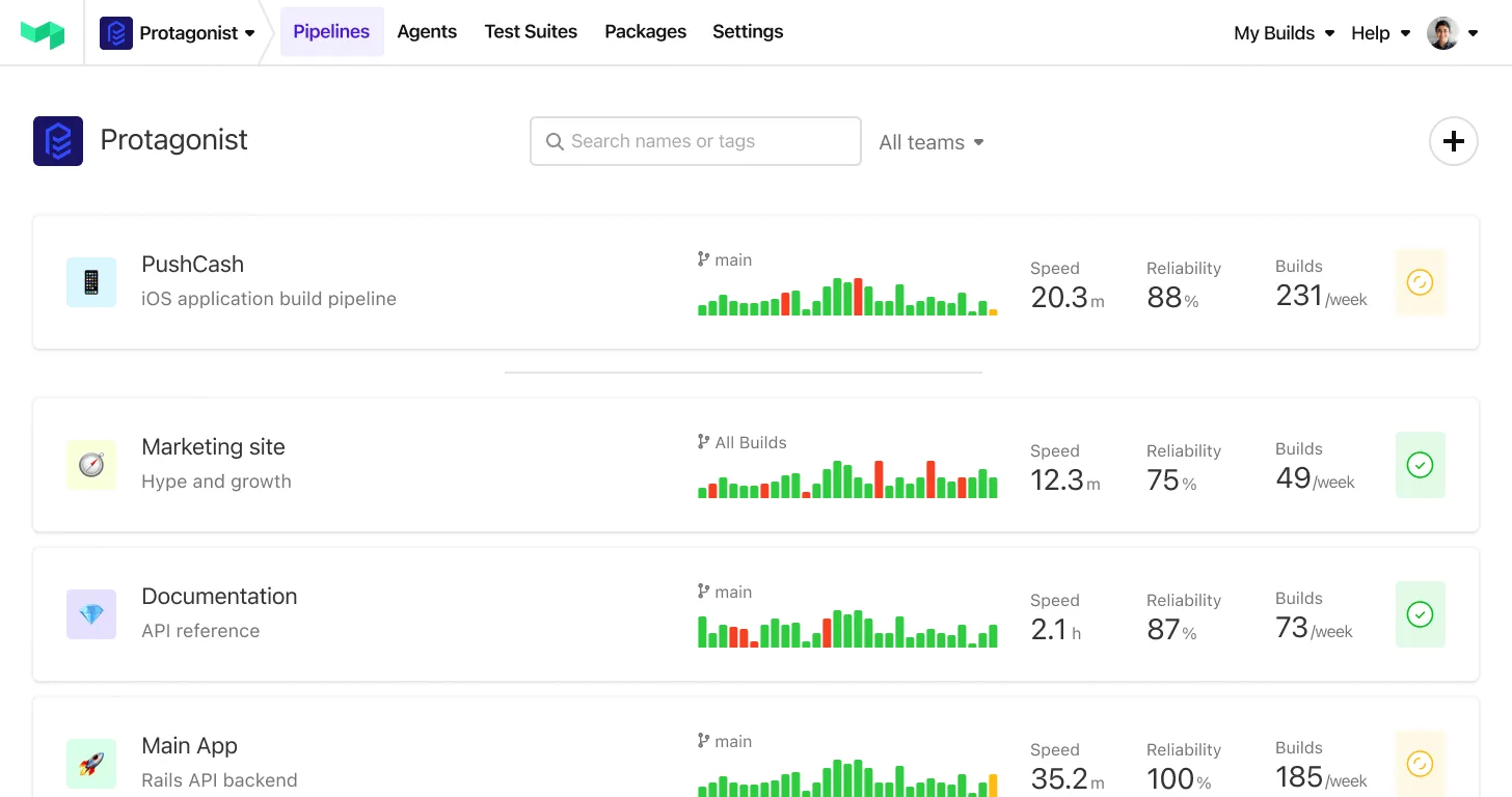
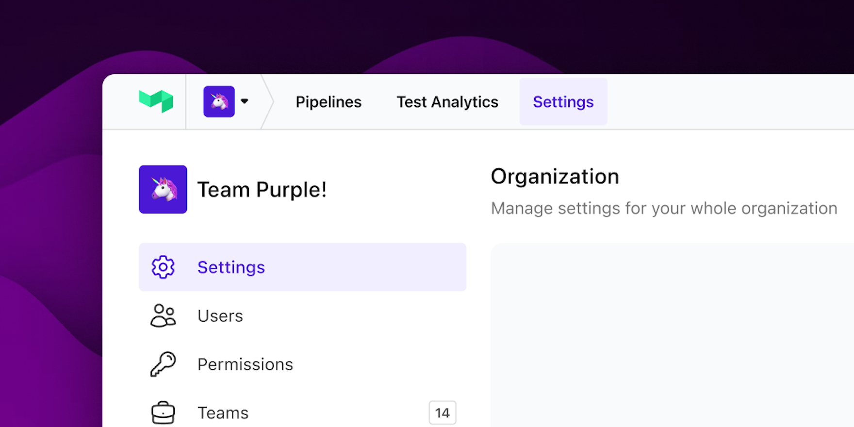
Hello, purple!
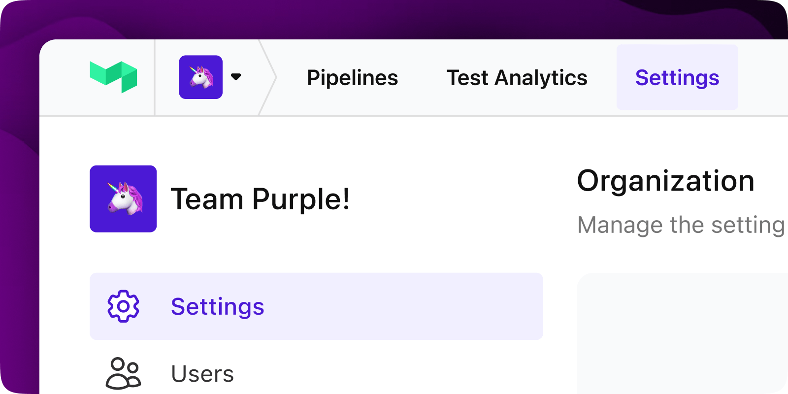
The introduction of our brand purple acts as a helpful guide to where you are in the product. You'll see it in a few more places soon–now, your location is very clear in the sidebar and main navigation. This work also expands on our commitment to accessibility by making sure we use colors and contrast that are visible to everyone.
Standardizing the look-and-feel of our UI and creating consistency across our products is something that takes some work to keep on top of, but the benefits are apparent in an intuitive and seamless experience.
New fixtures
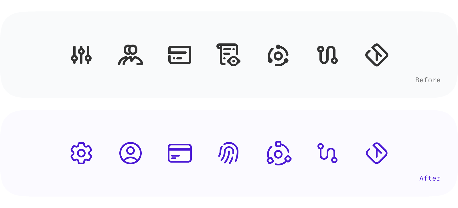
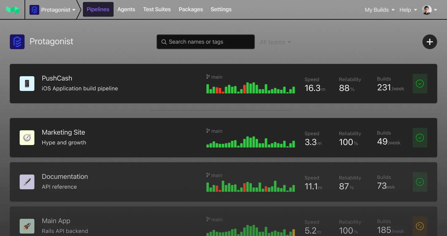
In a recent catch-up, I described how icons are a little similar to door handles. I’m a big fan of analogies, so you’ll have to bear with me on this one. They're something you shouldn't really notice, but if they're loose or hard to use, they add more harm than use. In this sense, our icons had come loose–a little awkward and unintuitive. Having added to them without much thought over the past eight years, it was finally time to adopt a more unique and consistent style, something we could grow with, much like the colors.
Using Heroicons by the fantastic Tailwind team as a start, we've combined a handful that match our style with our own custom-drawn icons. Individually the difference is almost imperceptible, but I hope you'll agree that they add to a more harmonious and consistent feel all together.
The ‘One Day Purple Party’
As I’m sure any modern development team can relate, building anything that spans an entire codebase can be tricky. Thanks to some really thoughtful cross-team collaboration efforts, these changes were the opportunity for us to come together and try something new—setting the foundation for future cross-product work. One of the fun ways we tackled this project was the One Day Purple Party (#odpp): a 6-hour open Zoom call with a couple of breakout rooms and a whole bunch of participants. The agenda was a one-day spike to make as much progress as we could realistically manage where design decisions were being made in realtime, and conversations were happening across codebases and languages. Naturally, the work extended well beyond that initial spike, but the foundations for success were definitely set there and then. Plus, we had a heap of fun.
What's next
Do these kinds of improvements pave the way for things like dark mode? They sure do, but you didn't hear that from me! We're focused on the next-generation of Buildkite—from small improvements to whole new products and experience–so you can consider this just a taste of what's to come.
If I’ve piqued your interest, you should join our March 2023 release waitlist; it’s going to be a good one.